Case Study: Grayson Texas-Blended Whiskey
Written By:
Alexandria Gillespie
Alexandria is a brand strategist with The Uptown Agency. Her beat is trends, insights and all things brand strategy.
May 24 2024
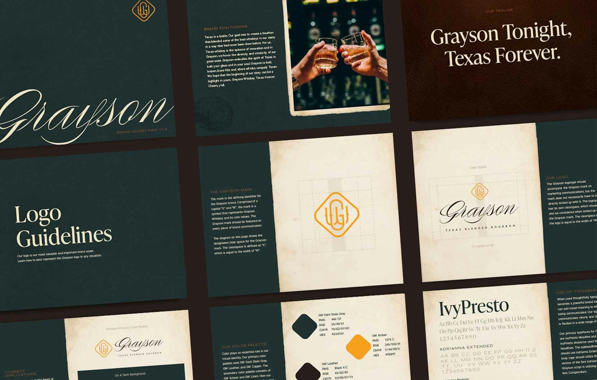
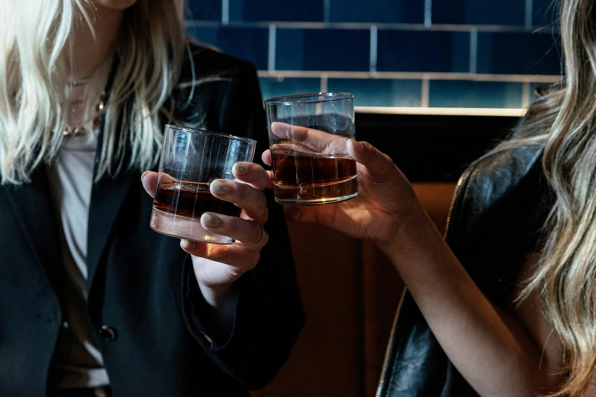
Grayson embodies the spirit of Texas in both your glass and in your soul. Grayson is bold, brazen, bona fide, and, above all else, uniquely Texan. It is the taste of exploration and sophistication.
Founding company Jay Chris Management set out to create a bourbon that blended some of the best whiskeys in our state, in a way that had never been done before. For them, Texas whiskey is the epitome of innovation and in Grayson, they honor the diversity and creativity of our great state.
Needing a name, a story, and a visual identity, JCM came to RBA (recently acquired by The Uptown Agency) to do what we do best. And, we also helped connect them to one of the eventual founding partners. How’s that for a value add?
What we did
Brand Strategy
Name & Tagline Development
Brand Messaging
Brand Design
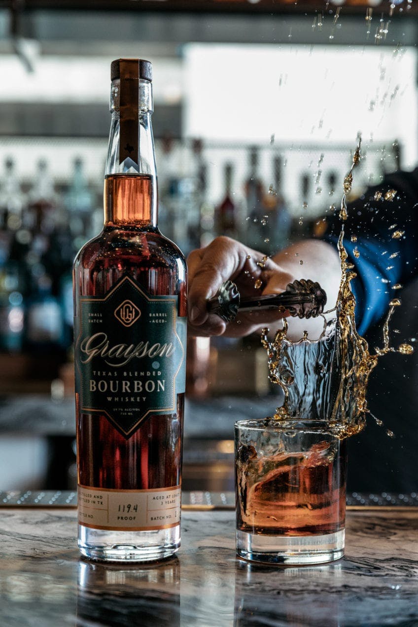
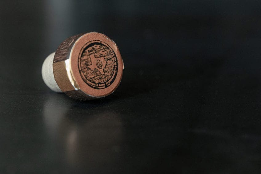
Package Design
Photography
Web Design
Web Development
Grayson tonight. Texas forever.
The first step we took was creating the positioning playbook for Grayson — who is the hero of the story and how does Grayson help solve their challenges and fears? This can be difficult (or easy) to answer for a whiskey, but through our process we established the brand story, which helped to lead us down the path to the name — Grayson. Simple and sophisticated. Rugged, yet refined. Grayson.
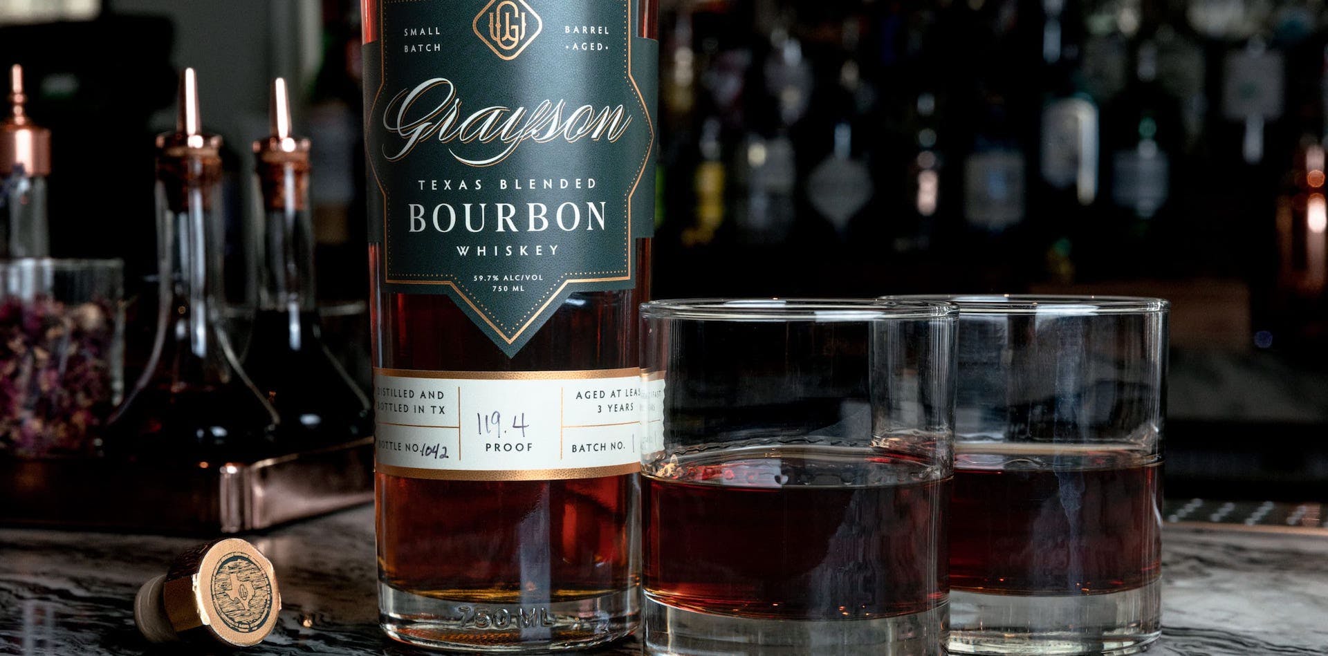
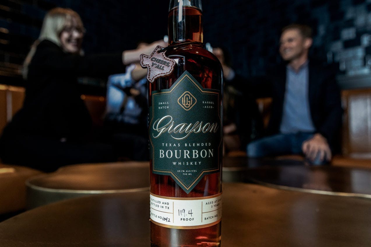
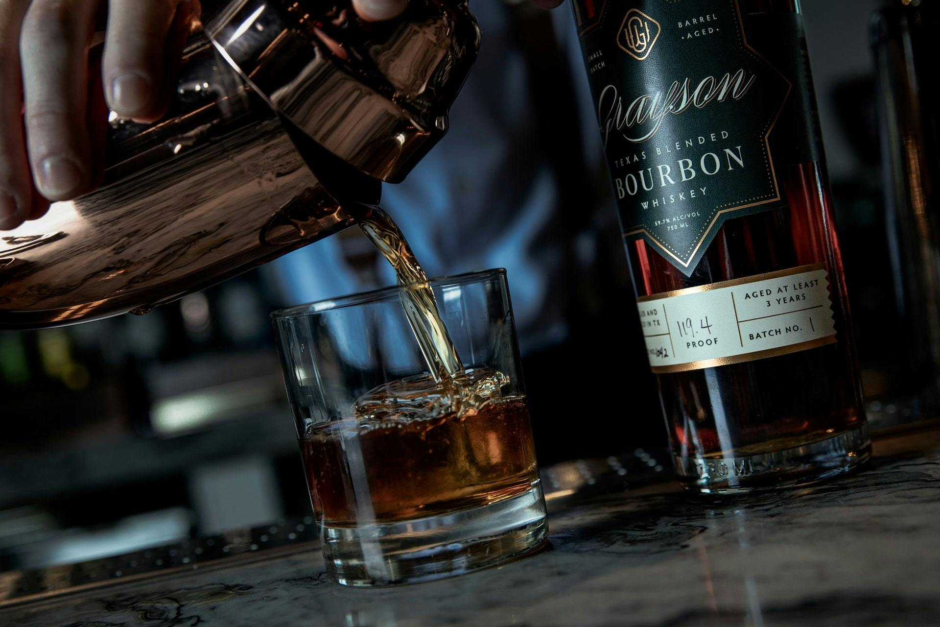
From here, we in tandem developed a unique look and feel for the brand, as well as the tagline. With Grayson Green as the primary color and accents of gold, Grayson looks like it tastes — rich, yet approachable. And because this is a small batch whiskey, we made it so that each bottle was hand numbered, displaying the true craft that goes into making just one bottle. That bottle is unique, just like every individual who buys it.
All of this eventually came together in the splash page, allowing people to get a feeling for this burgeoning whiskey brand.
So how’d we do? Grayson sold out of the online offering within an hour and a half, and within 2 days, every Spec’s in Texas was left without any on the shelf. A true partnership of a great product and great design. We can’t wait for batch number 2 to arrive in October. Better get your hands on it quickly.