RocketBrand (now The Uptown Agency) Rebrands as RBA (now The Uptown Agency)

Written By:
Shacoria Wilson
Shacoria Wilson is a Marketing Assistant at The Uptown Agency. She likes coffee, writing, and all things pink.
Jul 2 2020
There’s nothing like a pandemic to make you stop and reassess everything you’re doing. As the country shut down, we found ourselves in a moment to reflect on who we are. We’ve come a long way since our founding 4 years ago, and it was time for our identity to better reflect who we’ve become and the clients we serve. Today, on our 4th birthday, we’re excited to unveil our new brand with a new look, new website, and a refined service offering.
Like most of our world, we’ve changed significantly over the last 4 years. We’ve grown into a nationally recognized full-service agency with talented people from diverse backgrounds. We’ve built our capabilities and broadened our services while staying committed to the agility, efficiency and kindness we’ve always had (been known for?).
We like to say a brand is much more than a logo or a tagline. A brand is what people think about you — true or false, emotional or rational. But the verbal and visual aspects of a brand shape that perception and most importantly show how you want to convey yourself.
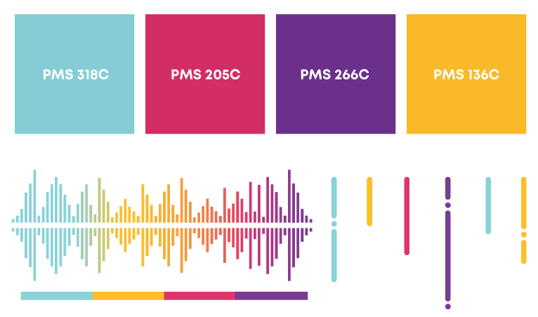
To reflect the energy, excitement, and diverse thinking we bring to our work, we’ve expanded our color palate to be brighter and more energetic — cyan, magenta, yellow, and violet.
We updated our typography to be more approachable, friendly, and crisp, with a geometric sans-serif called Mont for headlines, and Open Sans for body copy.

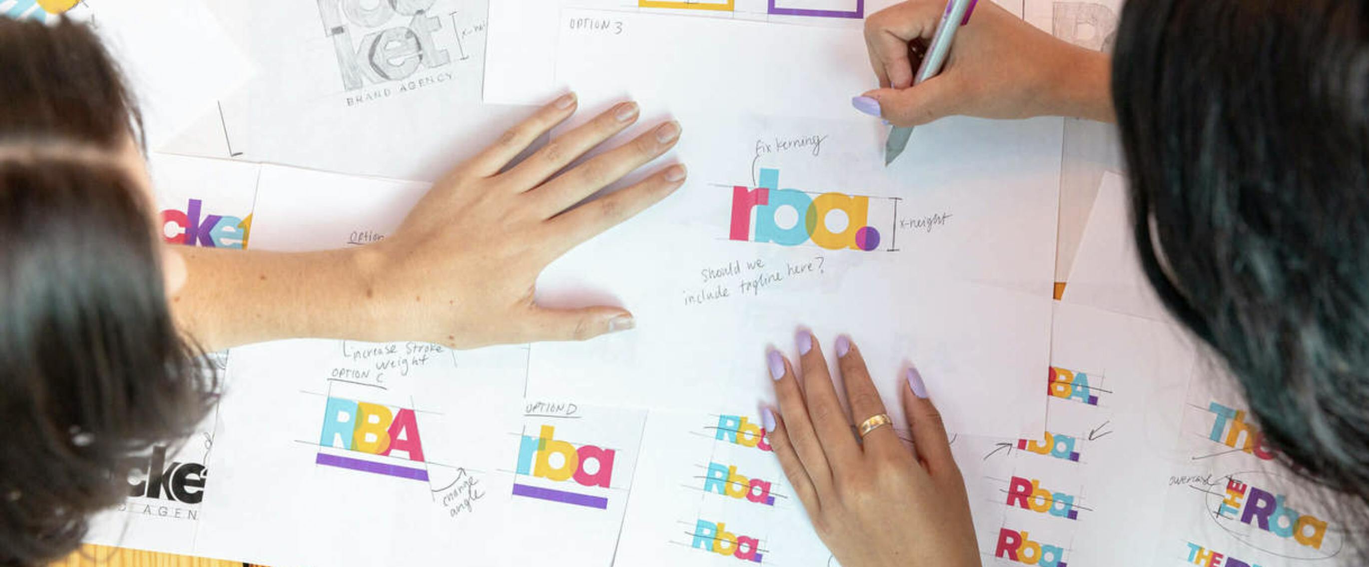
Once we made decisions on colors and typography, we kept coming back to our name. We love the culture and identity RocketBrand (now The Uptown Agency) has built, but we’ve grown a lot since we started. We wanted to preserve what got us off the ground, but we also knew our brand identity needed to keep up with who we’ve become. So we’re very excited to announce we are now RBA (now The Uptown Agency).
With these building blocks, we wanted a logo that conveyed our creative spirit, our commitment to transparency, and our strategic mentality. We also needed our logo to be approachable and memorable.
So what does this rebrand mean for our clients? Our choice to invest the time and energy into ourselves demonstrates that our culture demands constant improvement, and that we are never satisfied with “good enough”. Just as we do for our clients, we constantly push our own limits.
And we haven’t just been working hard on looking good. You gotta have substance with sizzle, so we are also rolling out updated systems this month for managing client campaigns, projects, and workflow that will ensure our client experience is better than ever.
We look forward to continuing our great work together.
Ross Cromartie, CEO
